
Mr. Souvik Nandy
INDUSTRIAL DESIGNER
In 2025, Mr. Nandy designed and donated to the association, the redesigned logo BASA and its Kisholoy Bengali Learning Program.
The Bengali Association of South Africa NPC got its redesigned logo in September 2025. This was crafted by Mr. Shouvik Nandy, a member of the association, during that time. Mr. Nandy has donated the design to the association in August 2025. The new logo was launched to public in September 2025 before the Durga Pujo celebrations.
(Above) The BASA Logo, (BELOW) The Kisholoy Logo.
In addition to the logo of the mother organisation, Mr. Nandy, also crafted the logo for Kisholoy: The Center for Bengali Learning in the same year.
The redesigned logo preserves the ethos of the current identity while infusing it with deeper cultural and artistic significance, making it more relevant and impactful for the modern digital era in the years ahead.
Mr. Souvik Nandy
INDUSTRIAL DESIGNER
In 2025, Mr. Nandy designed and donated to the association, the redesigned logo BASA and its Kisholoy Bengali Learning Program.
At the General Body Meeting (GBM) of the Bengali Association of South Africa held on 09 August 2025 at the Indian Consulate in Johannesburg, member Shouvik Nandy presented the association's rebranding proposal. The initiative stemmed from the February 2025 GBM, where members unanimously agreed on the need for a refreshed identity. The existing branding was widely regarded as outdated, amateurish, and inconsistent; further undermined by a website that lacks structure and fails to reflect the standing of the organisation. As a result, the members agreed that a comprehensive rebranding was a necessary strategic presence.

While the old BASA logo—featuring the acronym "BASA" and the colours of the South African flag—successfully symbolizes unity, it has increasingly been seen as lacking scalability and modern appeal. This limitation stems from the constraints faced by the team during the association's early years, combined with the rapid evolution of visual identity standards over the past two decades. Collectively, members agreed that a modernised, vibrant identity was necessary to represent BASA more effectively in today's context.
The new design seeks to embrace from the timeless wellspring of Bengali indigenous artistry—Nakshi Kantha embroidery perched atop mud huts, Santal paintings sculpted from clay, tribal tattoos etched on weathered Ajanta gyrating earthen floors, and even the delicate culinary sculptures of Bengali folk art. Alpana also emerged as a driving inspiration, echoing the ornate intricacies of ancient Bengali heritage. These forms speak of a land named Bengal, carries within it a language of beauty, symbolism, and belonging. Across borders and the politics of the subcontinent, the cultural consciousness persists—nothing can erase the collective memory that once breathing here—the very soul—are arranged in patterns that echo all the beauty wrought. The logo seeks to capture this spirit, weaving these natural forms into a tapestry of shapes that speak not only to memory but to the space for modern Bengali voice, an artistic statement that has documented society, the celebratory vivance of festivals, the warmth of community, and the enduring influence of a culture that transcends geographical boundaries. The logo becomes both a homage to heritage and a bridge to the future—an emblem that carries the history of Bengal and the modern digital era within its space realms, its soulful lines.
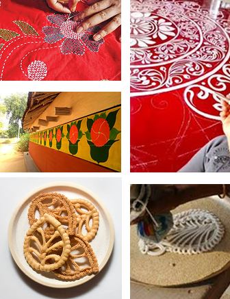
(Left Top) The geometric patterns of Bengali hand stitched embroidery "Nakshi Kantha"
(Right Top) "Kolka" or Paisley patterns forming cohesive modular arrangements in popular Bengali flow art "Alpana"
(Left Middle) Santal wall arts from Purulia in West Bengal, emphasising day cultural elements in mindful arrangements
(Left Bottom) Bengali white snack "Gokul Pitha" (Right Bottom) An intricate alpana name artist letter to craft "tea addda plans"
A World Out of a Core Form – Mother and Daughter – An Embryonic Relationship
All life begins with the mother. She is the source, the origin, the eternal vessel from which continuity flows. In this vision, Bengali culture itself becomes the mother form—nurturing, protective, ever-present—and we, her offspring, carry her essence across oceans and continents, far from her soil yet forever bound to her memory, her rhythm, her song.
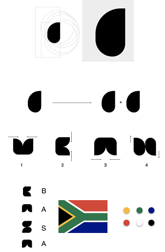
Mother Motif – "Kalka" or Paisley in Combination & Orientation forming the B A S A Acronym. A single core-from creating the logo. The final rendition includes the diverse colours and ethos of the South African Flag

The logo embodies this truth through the idea of "A World out of a Core Form." At its heart lies a mother motif, drawn from the timeless Kalke (paisley)—a teardrop-shaped symbol with a gently curved upper end, long revered in the art and textiles of Bengal. This motif, reoriented and intertwined in thoughtful combinations, gives shape to the letters B, A, S, and A, preserving the acronym not as mere typography, but as a living emblem infused with cultural resonance and meaning.
The philosophy flows further into the mother-daughter continuum through Kisholoy, BASA's language and cultural education initiative. The very word Kisholoy translates to "two fresh leaves sprouting from a seed." Its logo, born of the same mother motif, unfolds into tender twigs, the graceful swan of Goddess Saraswati, and the Bengali letter "অ," all symbols of awakening, learning, and inheritance. If BASA is the mother, then Kisholoy is her child—growing, branching, yet inseparably tied to its origin.
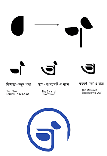
The inner meaning of different shapes and curves in the Kisholoy Logo
Together, the BASA and Kisholoy logos form a symphony of heritage and continuity, the Bengali ethos of cohesion, vibrancy, and celebration of roots intertwined seamlessly with the South African ethos, represented in the seven radiant colours of the national flag. It is both a remembrance and a renewal, a cultural embrace that honours the past while flourishing in the present.
The proposed logos were subjected to a rigorous and comprehensive evaluation process, including SWOT analysis, readability and legibility assessments, squint tests, and colour-blindness checks. Through these measures, it proved its strength not only in aesthetic appeal but also in functional clarity and inclusivity. The design demonstrated exceptional versatility and adaptability, maintaining its integrity and impact across diverse platforms and mediums—whether on signage, paper, fabric, or within the ever-evolving landscape of digital media.
These designs aim to establish a vibrant, inclusive, and culturally rich identity that resonates equally with the Bengali community and the broader South African context.